Albert Akpomudje SAN & Partners
A rebrand for Albert Akpomudje SAN & Partners, a leading law firm that engages in all areas and aspects of law practice.
Legal & Consulting
Albert Akpomudje SAN & Partners
2024
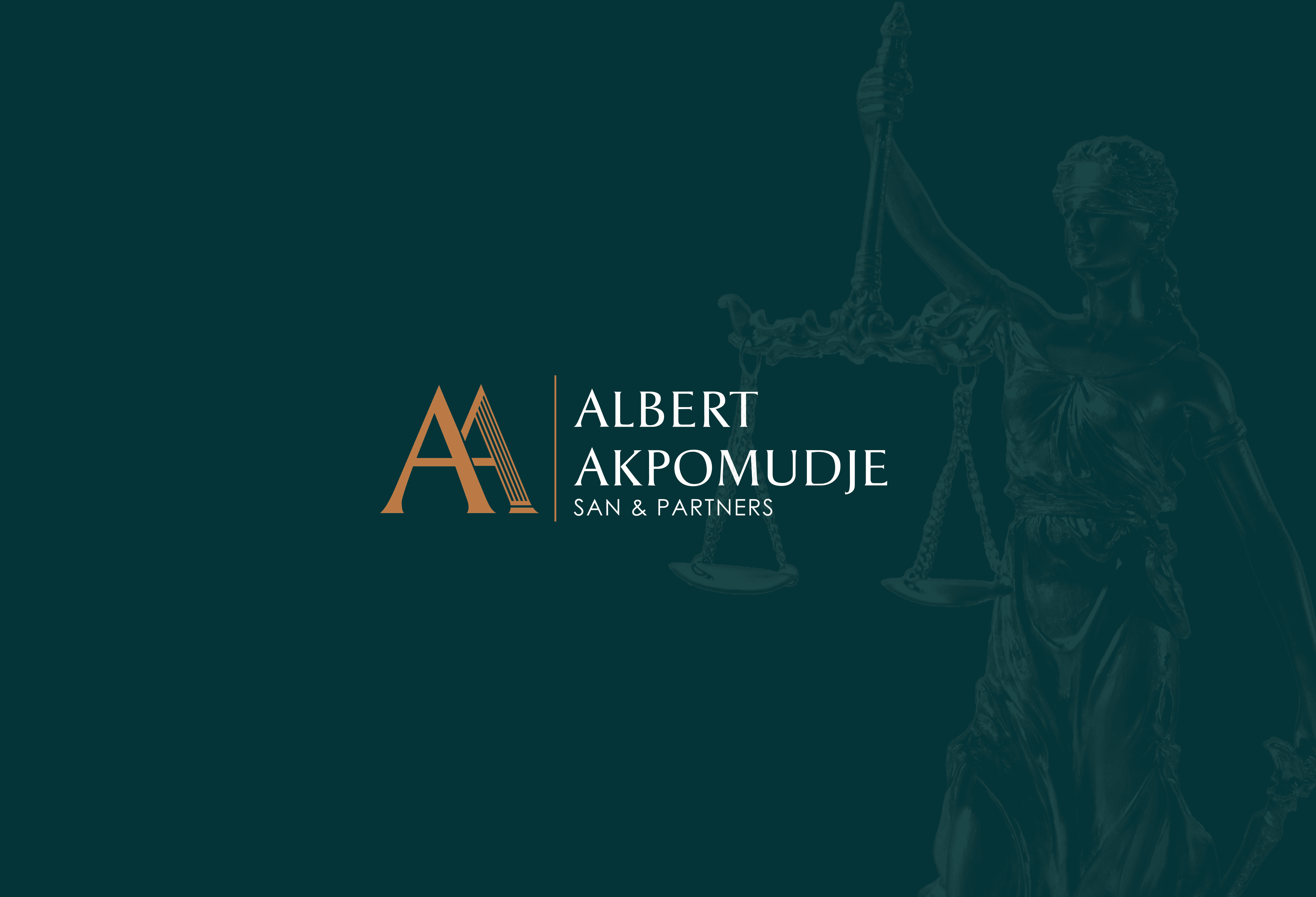
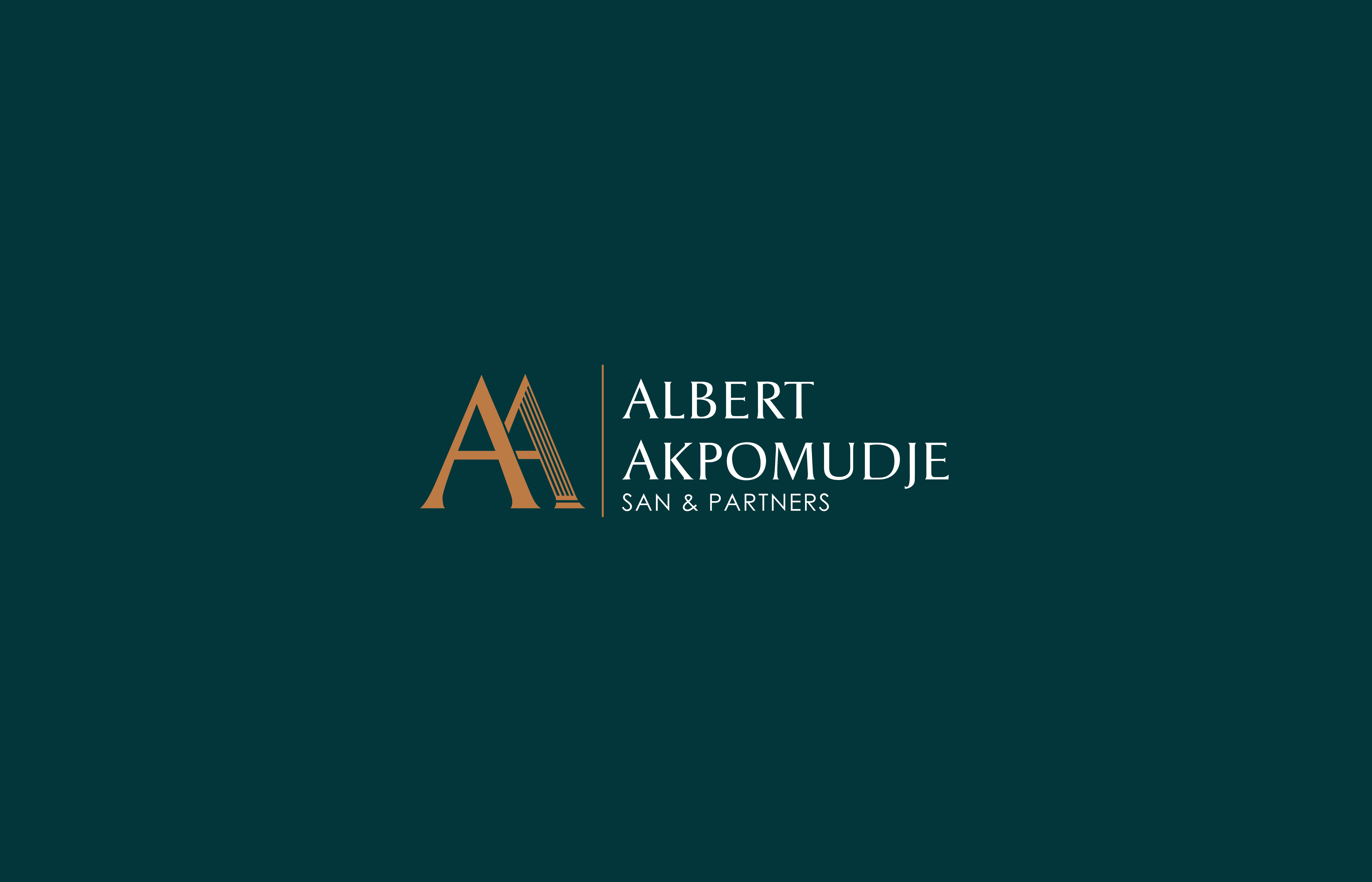
The new logo consists of a simple monogram (made up of the initials of the brand’s name) and a logotype that perfectly complements the feel of the brand.
The second “A” of the monogram is made up of a pillar which signifies strength, support and reliability, which are some qualities the brand possesses


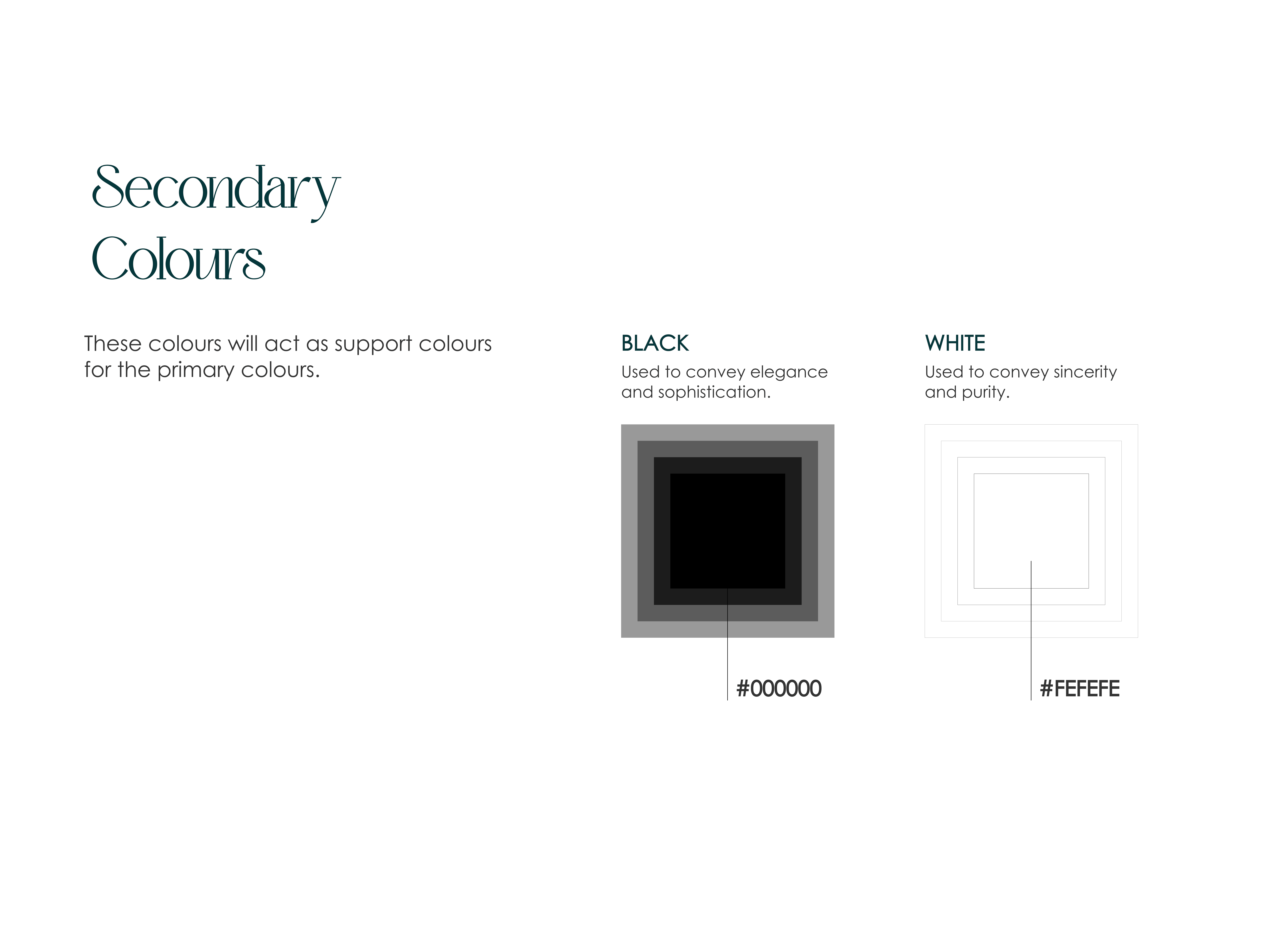
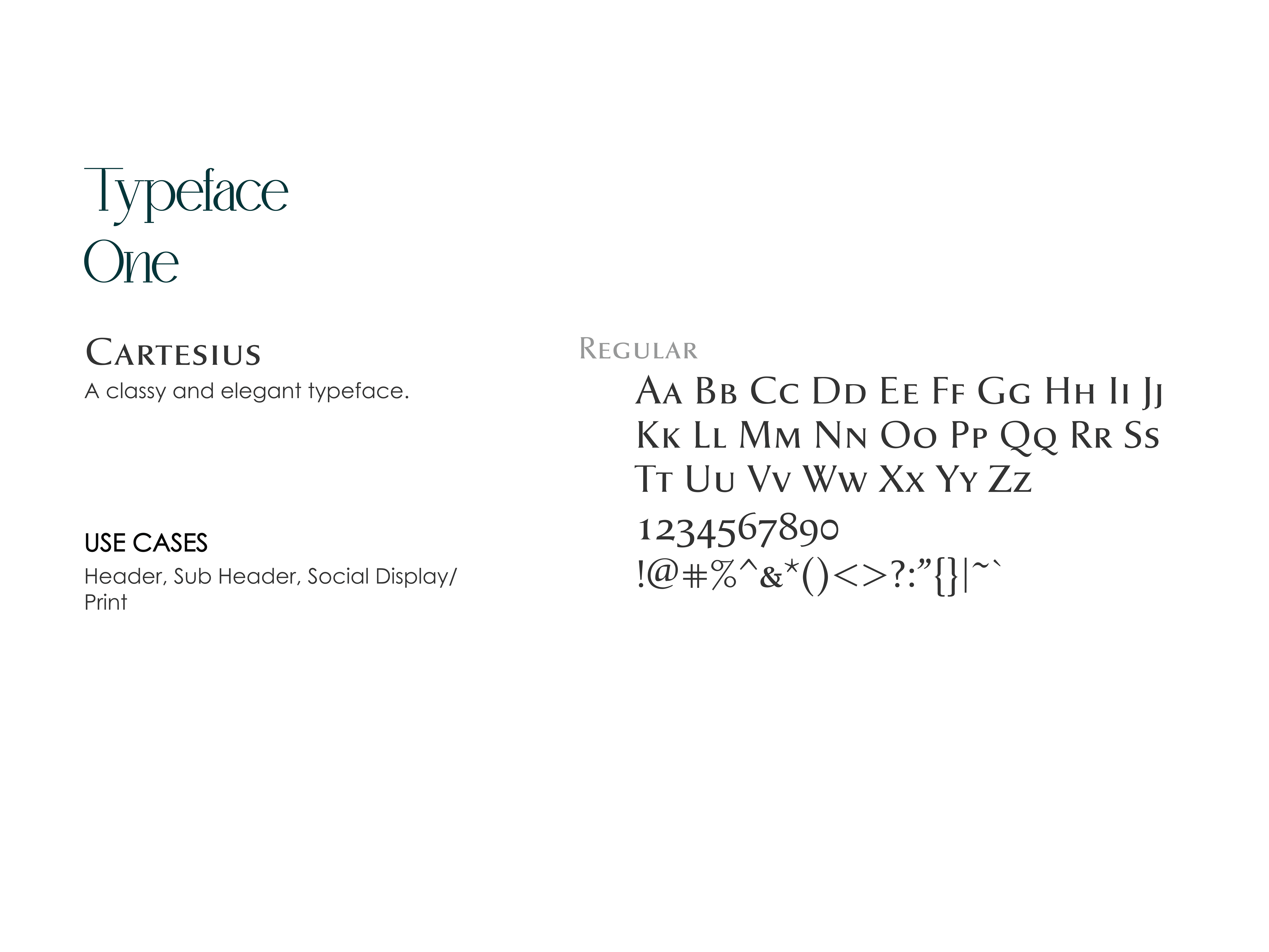
Both the color palette and typography were thoughtfully reimagined to align with the firm’s evolved brand identity. These updates weren’t just aesthetic; they were strategic.
The new visual language was crafted to better reflect the firm’s core values, such as professionalism and reliability.


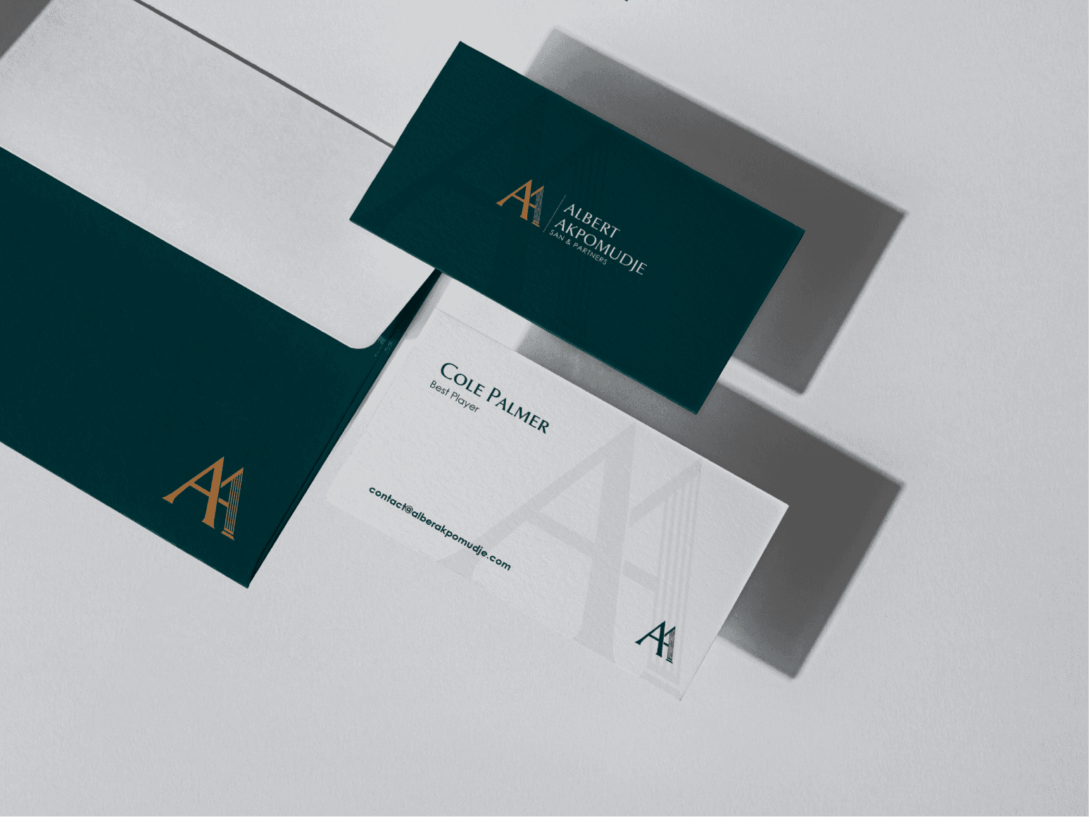
A rebrand would not be complete without visual representations of the new logo and other brand assets in practical use.