The Good Girl Fit
The Good Girl Fit is more than a fashion label, it’s a mindset. Rooted in the philosophy of Comfortably Confident pieces, the brand champions clothing that not only elevates your look but also embraces how you feel.
Fashion & Lifestyle
The Good Girl Fit
2024

The primary logo features a vertically stacked wordmark that merges elegance and flair. The sophisticated serif typography gives a sense of polish and maturity, while the delicate curves and distinctive ligatures in the words “good” and “girl” introduce softness and personality.
The secondary logo is a monogram built from the initials “g” and “g,” creatively mirrored and arranged to form a symmetrical symbol. This abstract yet readable emblem is ideal for use across brand touchpoints like tags, social media icons, or embroidery.


Brand Pattern 1 features a seamless repetition of the secondary “gg” monogram, creating a structured and consistent motif that reflects precision and style. It is fashion-forward and luxe.
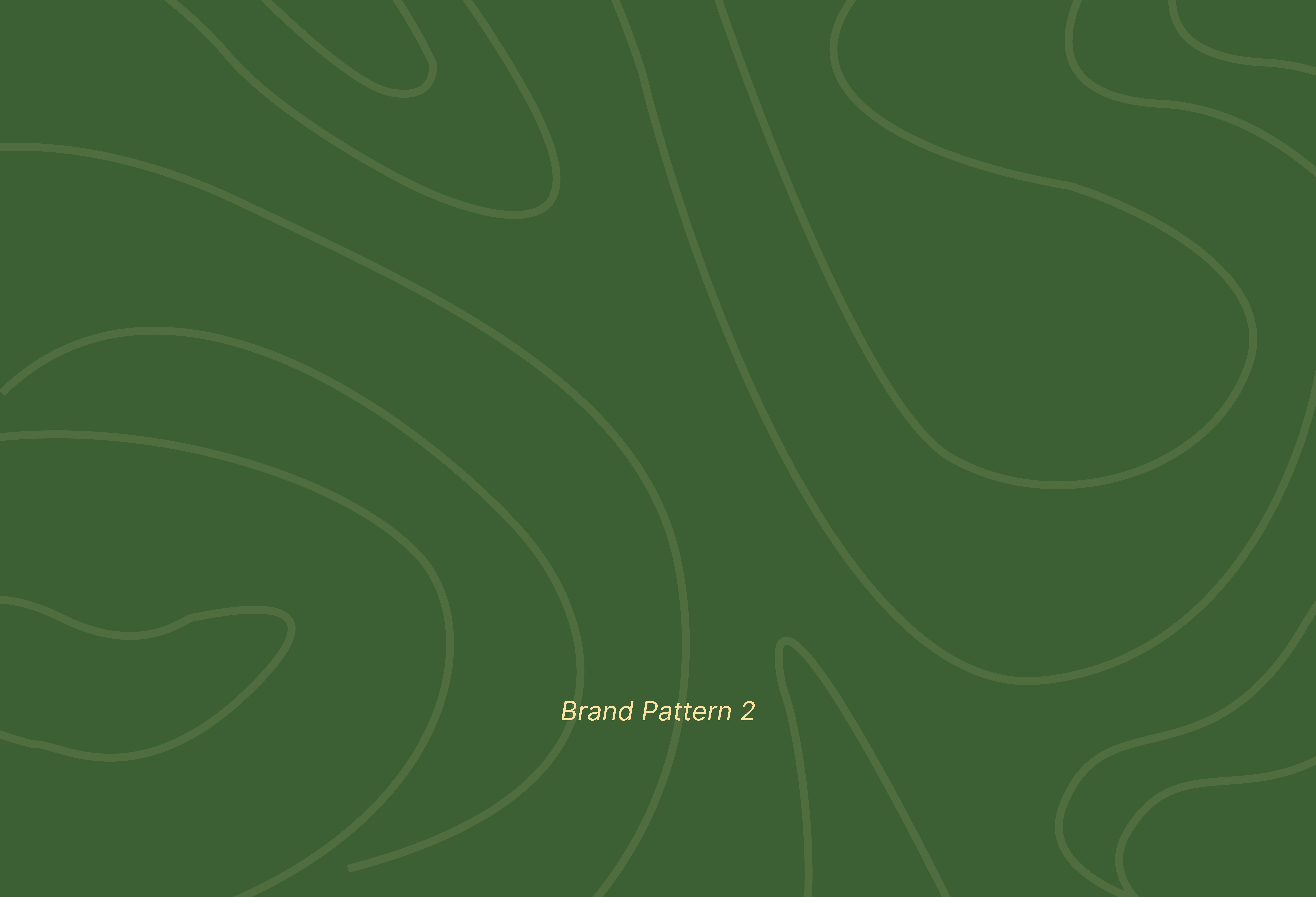
Brand Pattern 2, in contrast, introduces an organic flow inspired by topographic lines or natural contours. This softer, more fluid pattern symbolizes movement and ease.

This section brings the brand to life by showing how its visual identity works beyond the screen. It’s where the logo, colors, and patterns come together in a tangible, everyday way.
Pictured below are some packaging designs for the Good Girl Fit!